


Case Study:
Personal Brand Style Guide
As a writer and content creator, my brand needed to do two things at once: feel organic and handcrafted enough to reflect a distinct creative voice, while projecting a sense of credibility and maturity.
The brand identity was built from the inside out, drawing on personal coastal photography as the foundation for color, and extending that same natural, grounded sensibility into every subsequent decision — logo, typography, tone, and imagery. The goal was a system cohesive enough to be replicated consistently, but human enough to feel intentional rather than templated.
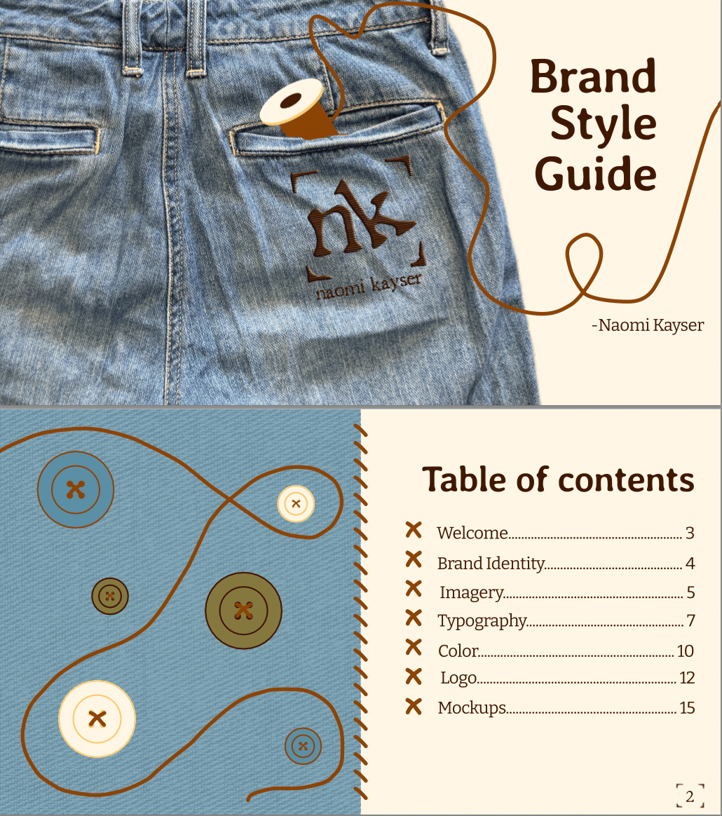
The style guide covers six core elements: logo, color palette, typography, imagery, brand voice, and do's and don'ts. The stamp-like logo introduces calculated imperfection through tilted lettering and an organic typeface. The six-color palette is pulled directly from coastal photography, keeping the visual identity rooted in something real. Three typefaces, Averia Libre, K Keci Sans, and Bitter, work in hierarchy, with Bitter's serifs grounding the body text in a voice that reads as considered and credible.
The completed guide functions as a replicable system, giving those working within the brand clear parameters while preserving the creator-forward quality the identity was built around.


Case Study:
Personal Brand Style Guide
As a writer and content creator, my brand needed to do two things at once: feel organic and handcrafted enough to reflect a distinct creative voice, while projecting a sense of credibility and maturity.
The brand identity was built from the inside out, drawing on personal coastal photography as the foundation for color, and extending that same natural, grounded sensibility into every subsequent decision — logo, typography, tone, and imagery. The goal was a system cohesive enough to be replicated consistently, but human enough to feel intentional rather than templated.
The style guide covers six core elements: logo, color palette, typography, imagery, brand voice, and do's and don'ts. The stamp-like logo introduces calculated imperfection through tilted lettering and an organic typeface. The six-color palette is pulled directly from coastal photography, keeping the visual identity rooted in something real. Three typefaces, Averia Libre, K Keci Sans, and Bitter, work in hierarchy, with Bitter's serifs grounding the body text in a voice that reads as considered and credible.
The completed guide functions as a replicable system, giving those working within the brand clear parameters while preserving the creator-forward quality the identity was built around.
More Brand Work:

Brand Logo
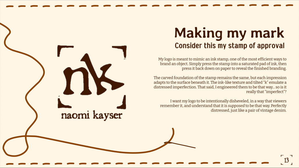
The logo is the foundation of my brand identity. The typeface chosen to reflect an organic personality, with intentionally tilted lettering that introduces a sense of calculated imperfection. The stamp-like quality of the mark adds a bolder, more deliberate edge to the overall aesthetic.
contact me!
Case Study:
Personal Brand Style Guide
As a writer and content creator, my brand needed to do two things at once: feel organic and handcrafted enough to reflect a distinct creative voice, while projecting a sense of credibility and maturity.
The brand identity was built from the inside out, drawing on personal coastal photography as the foundation for color, and extending that same natural, grounded sensibility into every subsequent decision — logo, typography, tone, and imagery. The goal was a system cohesive enough to be replicated consistently, but human enough to feel intentional rather than templated.
The style guide covers six core elements: logo, color palette, typography, imagery, brand voice, and do's and don'ts. The stamp-like logo introduces calculated imperfection through tilted lettering and an organic typeface. The six-color palette is pulled directly from coastal photography, keeping the visual identity rooted in something real. Three typefaces, Averia Libre, K Keci Sans, and Bitter, work in hierarchy, with Bitter's serifs grounding the body text in a voice that reads as considered and credible.
The completed guide functions as a replicable system, giving those working within the brand clear parameters while preserving the creator-forward quality the identity was built around.
More Brand Work:

Brand Logo
The logo is the foundation of my brand identity. The typeface chosen to reflect an organic personality, with intentionally tilted lettering that introduces a sense of calculated imperfection. The stamp-like quality of the mark adds a bolder, more deliberate edge to the overall aesthetic.
contact me!